Client:
Design Essentials
Services:
Branding | Packaging | Design
Challenge
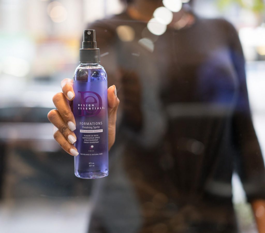
A multicultural haircare line with a legacy of success needed rebranding, with an updated, iconic logo to propel growth and position themselves as a premium professional salon line. They also needed new labels and packaging. Their previous bottles were white and featured their logo in black and bright purple.
Solution
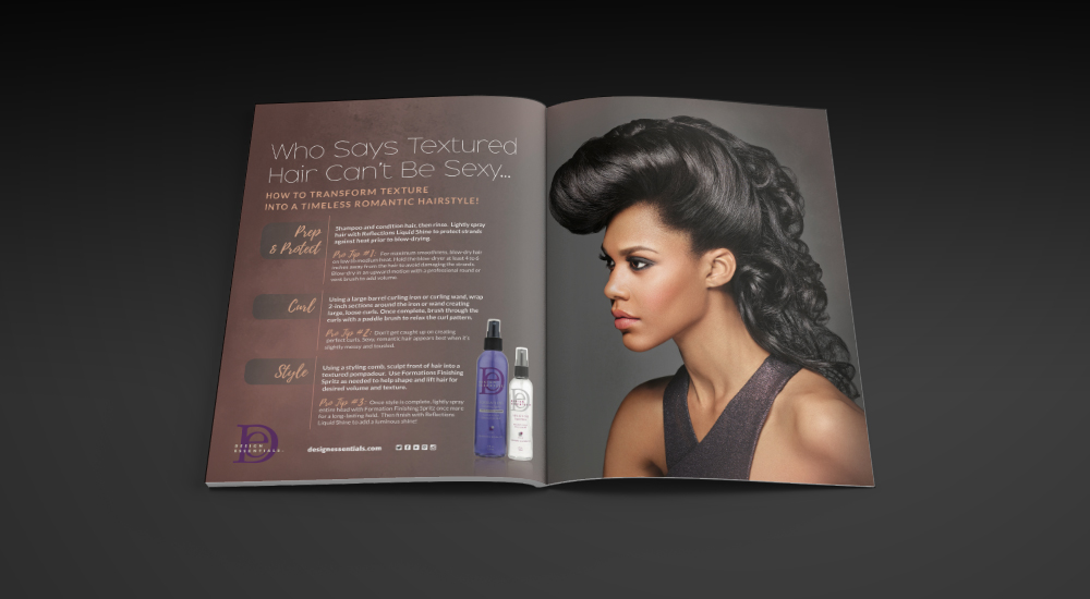
A complete visual rebranding, including a simplified, more iconic logo, product packaging, and marketing collateral. The new logo pays homage to the previous one by keeping the existing font for the capital letters “D” and “E.” To give the packaging a more upscale feel and support the premium price point, we chose a more sophisticated color palette of darker purple, green-tinted cream, and metallic gray.
We also developed highly-recognizable icons for each product category, which meant consumers could now recognize their products with only a quick glance. These icons were also featured in marketing collateral and on their website.
Over the years, CJ Mitchell Design has partnered with Design Essentials for many assets, including posters, brochures, ads, displays, and digital marketing graphics.
We’re proud to have been a part of the company’s growth. Design Essentials is now one of the top multicultural hair lines and has expanded into several sub-brands. Their products are now sold around the world and in several Ulta, Sally’s, Walgreens, and other large retail chains.